
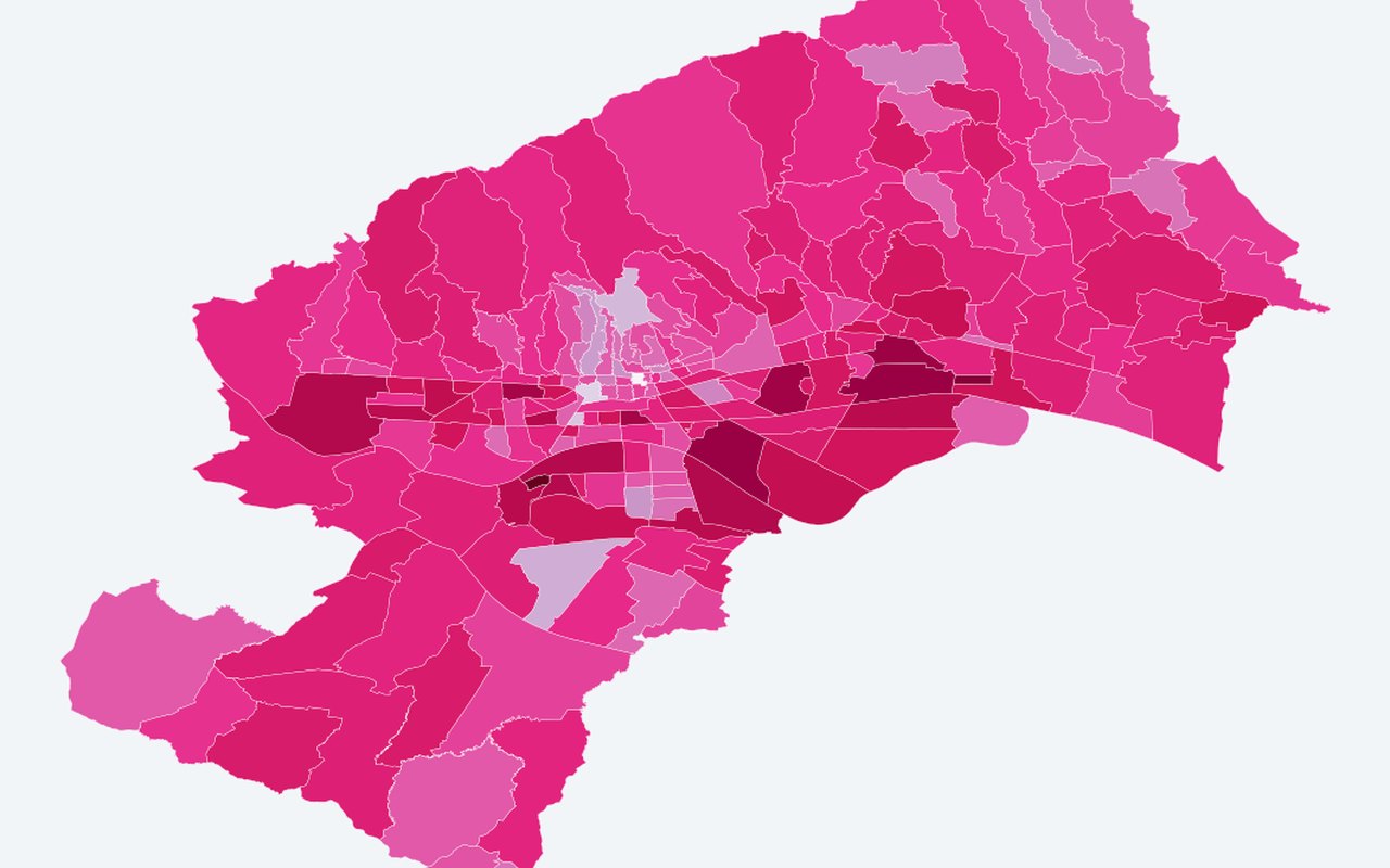
Working-age share 15–64 — MO polygons (2021)
Vulnerability & census
Share of neighbourhood population aged 15–64 — polygon choropleth (same pattern as 0–14 and 65+ shares). Use this to see who lives in hotter areas and where social sensitivity is highest.
What it shows
Fill colour from working_share (0–1); legend uses a robust neighbourhood-only band (2–98%iles, fallback 0–1) for clustered shares. Tooltip/popup include formatted percentage columns. **Off by default.**.
Data sources
DZS 2021 T1 Starost column 15–64 ÷ total population + ArcGIS neighbourhood polygons.
How it was prepared
Census and related demographic tables are joined to official neighbourhood polygons so heat and people can be read together on one map.