Population density — MO polygons (light fill)
Vulnerability & census
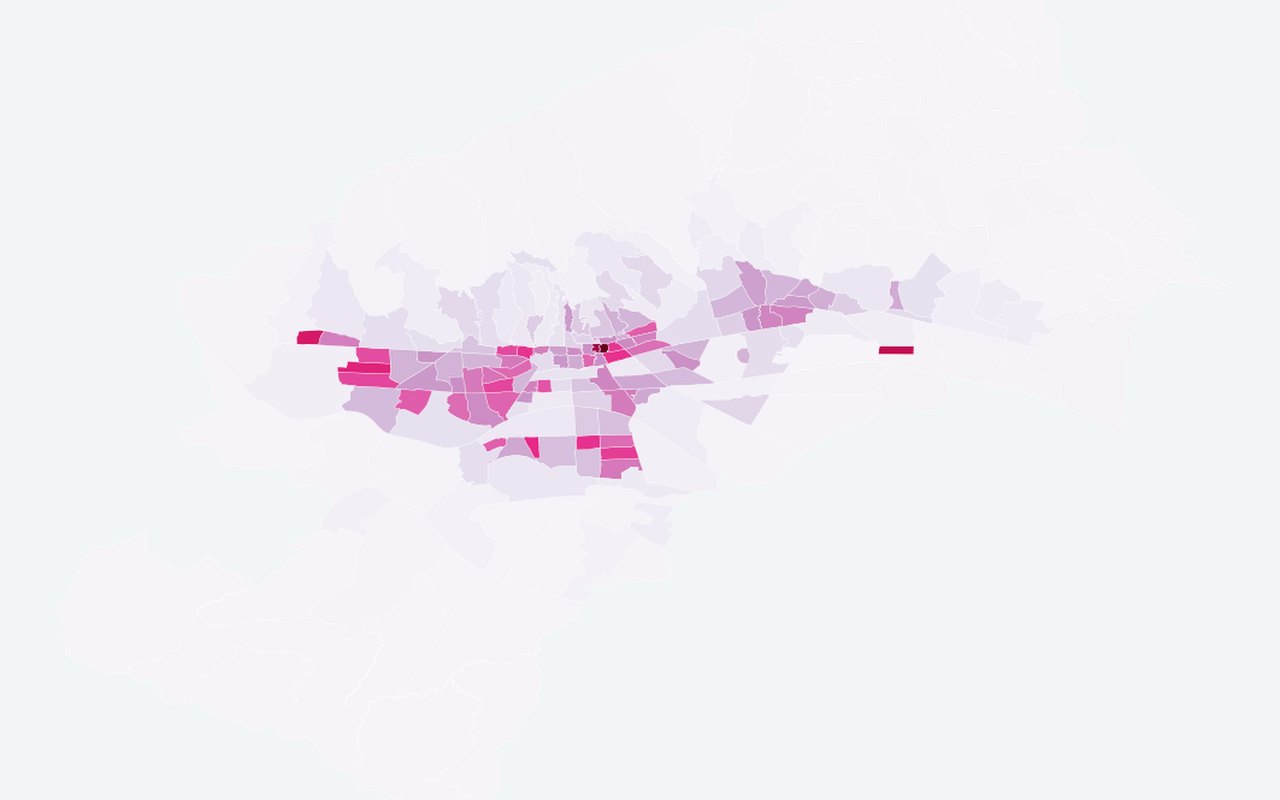
Primary map comparison for crowding — official people/km² on neighbourhood polygons (not centroid symbols). Use this to see who lives in hotter areas and where social sensitivity is highest.
What it shows
Light blue choropleth on population_density; colour bar spans **neighbourhood 2nd–98th** density percentiles (values outside saturate). Not the combined 0.6×pop + 0.4×density planning index. **Off by default** on the integrated map.
Data sources
DZS 2021 T1 area + population + ArcGIS neighbourhood polygons.
How it was prepared
Census and related demographic tables are joined to official neighbourhood polygons so heat and people can be read together on one map.